Is your site unresponsive to consumer needs?

Responsive sites are the hot topic of the moment when it comes to considering website design. The amount of online mobile traffic has grown exponentially. So, how has your business responded to these changes?
The internet is no longer tied to the single location of a user’s computer. The mass adoption of smartphone technology and mobile devices means that your site can be viewed from any location. Some forecasts predict that mobile traffic will overtake traffic from desktops within just a few years; if your site doesn’t support mobile users, then mobile users won’t support your site.
What does ‘responsive design’ actually mean?
A responsive site has one URL and one consistent user experience which operates across a number of devices. Put simply, the site adjusts to fit the varying screen sizes of smartphones, tablets, netbooks and desktops.
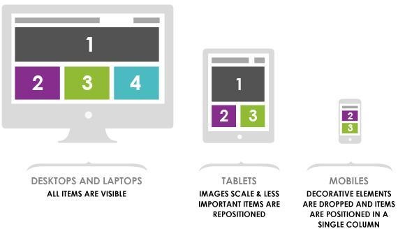
Optimised sites ensure that the same information is displayed, but the design may vary in order to cater for the needs of the user. For example, mobile sites tend to have a simple, clean design with minimal, relevant information and clear calls to action.
Prior to the rise of mobile technology, designers only had to consider the use of each site across different internet browsers. Now, smartphones and tablets have changed the approach towards design; consumers need to be able to continue their journey uninterrupted. Mobile devices affect a number of factors, including: screen size, support for Adobe Flash player, pixel resolution and click vs. touch. These factors are considered and the finished product is a fluid and responsive site which adapts to the needs of the user, irrespective of the device.
Don’t make your visitors bounce
Responsive design, why bother? Many people now use a mobile device as their primary browsing tool and your site should adapt to the needs of such consumers. As browsing tends to be done on the move or around everyday tasks – such as during a queue or a commute –time and patience is in short supply. This has resulted in high bounce rates for non-responsive sites accessed by mobile device users. If they can’t get the information they need easily, they will go elsewhere – to your competitors.
What’s in it for you?
Other than keeping mobile users happy, a responsive site has a shorter development cycle. It’s written once and enabled to run across multiple viewing platforms, rather than creating multiple mobile sites for each screen size variant. A responsive site is the closest thing to a ‘one size fits all’ solution - plus, if Google says it’s important, then it’s important. Google has officially recommended responsive sites, and typically awards them a higher rank. So, a responsive site is now a key consideration for SEO.
The future is now
The growth of mobile usage shows no signs of stopping. It’s convenient, and people are more comfortable using their smartphones and tablets to access the web. It’s inevitable that new gadgets and devices will come onto the market in the coming years, all with their own screen sizes and resolutions. If you haven’t taken mobile technology into consideration within your site, then it’s time for an overhaul.