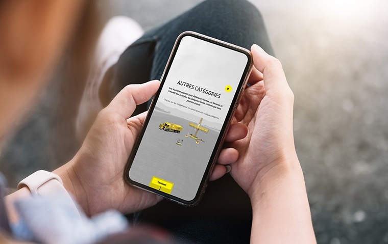
Mobile ready elearning content for learners on the go
With the increasing proliferation of smartphones and tablet computers, mobile internet usage is becoming ever more prevalent.
This has consequences (mostly positive) when it comes to promoting your brand or sharing content within your business infrastructure.
These days, for content to be successful it needs to be readily available on whatever device your audience has to hand. Within an elearning environment, embracing the mobile revolution means that you can reach employees at any time of day and when it’s convenient to you (and them).
To show you just how important the mobile marketplace is and how useful it could be to your business and its elearning efforts, let’s look at some statistics. The last five years have seen steady growth in mobile traffic but this increased by more than 50% in the last 12 months. Currently mobile and tablet internet traffic stands at 20% of all internet traffic (December 2013).
The statistics speak for themselves and really it means that businesses can’t afford to miss out on mobile users. The important thing to remember is that content has to be optimised for mobile screens – not just available. User experience is a very important consideration when it comes to retaining visitors and ensuring that they have an enjoyable experience on your site.
Here are some tips to making mobile users have a more positive experience on your website. We’ll be a little more general than elearning platforms but the advice can be utilised through BYOD policies to ensure that your learners can use smartphones and tablets to meet their learning deadlines.
The user experience – navigation and design
Users have expectations when it comes to the online world. They want websites and learning platforms that are easy to navigate and optimised for the mobile screen. If you don’t provide this experience then visitors will simply go elsewhere or your learners will struggle to meet deadlines and do the necessary work and training.
Here’s some advice on how you can deliver content to mobile users
Be specific
A mobile site should be exactly that – one designed to fulfill the needs of smart phone or tablet visitors. It should be its own website and separate from the desktop version. The internet functions differently according to the device used to browse it so websites should reflect this.
Your mobile ready platform should be a simpler version of your desktop alternative. Consider building it using basic colours and clean and minimalistic content accompanied by easy navigation. Of course there are positives and negatives when it comes to running a mobile ready site. It will be a stripped down version of the main site meaning that the content available will be slightly more limited. Less content means that a website loads much more quickly (this can lead to a lower bounce rate) but with less content.
Really a mobile ready website is designed to provide visitors with the exact information that they’re after. It doesn't promote browsing and exploring in the same way that a desktop version would. There can be branding issues when it comes to a mobile website due to the fact that it has to be stripped back. It can be difficult for visitors to access information other than what’s provided on the simplified website.
However when it comes to elearning the stripped down mobile site is probably not too much of a problem. Instead this much more specific medium can be tailored for the learners and their exact needs. Only present them with information that they need to learn and information that’s actionable. Your internal elearning network will function much more smoothly with a more simplistic design approach.
Using a mobile app
Responsive web design has been something of a buzzword in recent years. It ensures that a website is optimised for whatever technology accesses it.
It isn't the only option however and a business could consider using a mobile application to better reach its audience or learners. A mobile application is a separate entity entirely and has very little linking it to the main desktop site or even the mobile one. Instead a mobile app is a more bespoke choice that delivers perhaps the best user experience for smartphone or tablet users.
A mobile application can offer much more complex iterations than its mobile or desktop variants. There is however a much higher financial cost and in general a bigger commitment when it comes to maintaining and even designing a mobile application.
The need for multiple marketplaces
Applications are costly in terms of time and money and the whole process is an intricate one. There are additional costs when it comes to ensuring that the application works on multiple marketplace platforms like Android, iOS, and Windows Mobile. However if you’re looking for a great way to connect with employees an app is an effective consideration.
The first step when it comes to ensuring that your content is easily accessible by mobile users is to make sure that your content can be read by users on the go. Then it’s worth considering the platform that those users view the content from. Consider a mobile version of your site, or a more responsive design, or a mobile application as each one will deliver a better and more bespoke user experience. Pick one with your business and its needs in mind.
When it comes to elearning platforms the above advice is just as pertinent.
Use the mobile revolution to reach your staff better, to keep them up to date with training, and to ensure that your content is accessed by the widest audience possible.