Accessibility and usability for all
Usability is like oxygen — you never notice it until it is missing…
Anonymous
Introduction
It’s practically impossible to discuss web site development without mentioning accessibility. Not something in which only web developers have an interest, accessibility is increasingly an issue that site owners are becoming aware of — especially after the recent enactment of anti-discrimination legislation. To most people accessibility, in the context of the web, seems to be synonymous with making a site suitable for blind users browsing with a screen-reader.
This paper discusses how the needs of all users — including those with visual, cognitive, or motor disabilities — must be addressed, along with how varying levels of computer literacy and competence should be handled. We also conclude that sites which address specific needs allow the general public as a whole to benefit from improved usability.
Accessibility and usability
Key UK facts
- 1.4 million people have learning disabilities
- 205,000 people are registered blind or partially sighted
- 10% of people have some form of dyslexia
See references for sources.
So what does accessibility for the web actually mean? The internet is such a fantastic resource, containing information on every subject you can imagine (and probably more on subjects you can’t) and while the veracity and worthiness of much of the content is debatable, there is no reason the information should only be accessed by “normal”, average people. A significant number of people have some sort of disability, and this must not preclude them from using the web.
Unlike nearly all other computer software, web sites don’t come with a user manual. This means, more than ever, their usage must be completely intuitive, straightforward and usable. As Steve Krug said: Don’t Make Me Think.
Considerations for users with visual disabilities
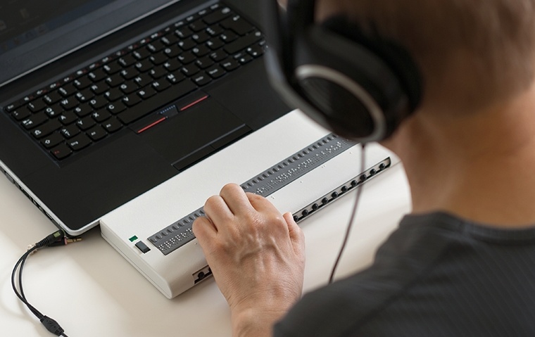
A visual disability does not necessarily refer to someone being blind; there are a wide range of visual impairments. While people with severe visual impairments may use assistive technologies such as a screen-reader or tactile/Braille display, many users with slight visual impairments will use a standard desktop browser configured to use large fonts or high-contrast colouring. This makes it important that a site is designed with this in mind and supports someone customising fonts and colours.
Although the provision of text-only versions of sites is fairly common, it’s always advantageous to make the standard version as accessible as possible. Many who may benefit from using an alternative version feel uncomfortable doing this, both because there can be a tendency for it not to be kept as up-to-date as the standard version, and because it implicitly supports a policy of being “separate-but-equal”.
Use of colour
Colour-blindness affects around 1 in 12 men and 1 in 200 women in the UK — not an insignificant proportion of the population. The most common form of colour blindness, deuteranomaly, results in an inability or difficulty in differentiating between reds and greens.
Colour should never be used as a sole indicator of information. A way to help you ensure this is to view the screen in grey-scale or black-and-white only; this should reveal any issues. The use of text or an image in addition to (or instead of) the colour is often the best solution. This will aid colour-blind users, and will no doubt be of benefit to other users as well.
Within society, colours often have meanings associated with them. Red might mean stop, hot, or danger for example, while green could mean OK or go. It’s impractical to use only colours that do not have an associated meaning, but it’s important that their use is consistent and does not contradict preconceived ideas. We can understand why it would be unwise to have a Go button coloured red and a Stop button coloured green.
An interesting physiological demonstration involving colour is the Stroop effect.
Text alignment
Left-alignment is the formatting English-readers will find most comfortable to read. An expectancy has arisen from years of experience reading paper-print that “forces” one’s eyes to scan left to the point at which the previous line started in order to continue reading the next line.

The yellow lines show “rivers of white space” that can cause problems for people with dyslexia.
When text is fully justified enlarged spaces often occur above one another, creating an illusion of empty columns often referred to as “rivers of white space”. Research has shown that text formatted in this way is often especially difficult for people with dyslexia to read, wherea Llft-aligned text is much easier. Right- or centre-aligned text is fine when used as headings or as a single line, but if the text wraps over more than one line left-alignment should be used.
Considerations for users with cognitive disabilities
Consistency
A key design principal that benefits the audience as a whole as well as people with certain cognitive disabilities is to be consistent and not break a person’s conceptual model of a web page. Amongst others, users tend to expect:
- links to be underlined — so don’t underline anything that isn’t a link;
- the back button to work — so be careful if using technologies such as Flash and AJAX; and
- a standard interface — hiding toolbars or changing the colour of scroll-bars only removes those things on which people have come to rely.
Language
Although users with special needs will have become accustomed to it not being the case, the language used online should really be written in a very generic way, i.e. not on the assumption people are browsing visually. For example, the act of clicking refers to pressing the button on a mouse or trackball. Links should therefore be “followed” or “selected” to take into account people making use of other devices.
It’s also important to ensure content on web sites is as easy to understand as possible. Although a site may be intended for a technically-literate audience or for those that revel in jargon, it’s possible to write content that is (at least partly) comprehensible to a lay person. The Plain English Campaign is a British organisation that promotes good writing in all walks of life.
Considerations for motor disabilities
Users with motor difficulties may be unable to use the standard keyboard-and-mouse combination and will instead make use of alternative devices to interact with their computers. These could range from advanced voice-controlled systems to single-click devices (e.g. as Professor Stephen Hawking uses) or even air-pipes (as the late Christopher Reeve was reputed to use).
As mentioned above not everybody navigates the web by using the mouse to click on links and buttons. People with a motor disability may use a system that draws a grid across the page and then stating in which cell the link is located (e.g. E2 or B5). This interface becomes increasingly long-winded the closer links are to each other because a smaller grid is required to differentiate between links.
It’s good practice to accommodate such an interface by ensuring that, where ever possible, links are not position too closely together. Don’t just separate links with white-space!
Ensuring sufficient distance between links will also benefit mouse users: it makes it less likely that they will click the wrong link accidentally and reduces the cognitive complexity of the action.
Sensible structuring
In a previous Sponge white paper, the idea of separating the structure of a web page from its design was discussed. This has several advantages. By creating the content of the page in a structured way, the user has the choice of how they want to access it. From an accessibility perspective this means the site should work correctly in screen-readers and tactile/Braille displays. However, this does not only benefit people with disabilities: a correctly structured document should work on any compatible device, such as mobile phones or PDAs, and even these wrist-watches of the future we always hear about.
Conclusion
The fields of accessibility and usability are massive and encompass far too much to cover in a single paper. This article has acted as a good introduction and highlighted key points for consideration. Although over the past few years a considerable improvement has been made in the accessibility and usability of many web sites, there is still much to be done to ensure everything is accessible to all.
This paper has identified various principals of good practice, including some examples and the reasoning behind them. We hope we have shown, in a limited sense at least, that by making a site accessible to users with specific disabilities it almost inevitably becomes more usable to people without such disabilities.
Although there is no doubt a big mountain to climb to make the whole web accessible to all, with the ever increasing support for improving accessibility there is now most certainly a clearly signposted path.
References
- Human-Computer Interaction, Jenny Preece et al., 1994.
- Accessibility of a web site’s graphical presentation: colour and contrast issues, TechDis, April 2003.
- Statistics on sight problems (UK), RNIB, January 2006.
- Statistics on learning disabilities (UK), Foundation for People with Learning Difficulties, July 2003.
- How people with disabilities use the web, W3C, December 2004.
- What is dyslexia?, The British Dyslexia Association.