5 Ways for better storytelling through Data Visualisation

The goal of anyone with design skills to create graphs and charts should always be to tell better stories using data: present data in a way which is engaging, understandable and above all - clear.
In partnership with the Financial Times, Sponge and Skill Pill organised Data Visualisation Webinar, where Alan Smith, OBE, FT's Head of Data Visualisation, and Gerry Griffin, Skill Pill founder and CEO, discussed five best practices for better storytelling with data.
Alan, also known as the 'Chart Doctor', and Gerry take us through some fundamentals of data visualization, explaining key components of the Financial Times Visual Vocabulary. This includes the difference between clarity and simplicity, Hans Rosling’s combining of data relationships and some common pitfalls to avoid when one communicates with data.
Focus on clarity not simplicity
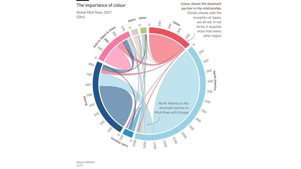
Alan: “If we take a look at the visual vocabulary, there are some interesting new charts which most people haven’t seen before. These charts are really helpful for understanding the benefits of choosing a complex visualisation over a more well-known but simpler one. If we take a look at the chord diagram below, this is an interesting visualisation to examine.”
Gerry: “What is the benefit of a visual like this?”
Alan: “So with this sort of graphic that shows the flow of data, it is important to remember that not everything needs to be understandable in five seconds. If you had a pie chart, you could have understood it that quickly. But if you learn how to read this graphic, you come away smarter. With the chord diagram you can see data flowing from one place to another, that's the relationship. It could be imports and exports, it could be people migrating from one place or another. Anything where there is a flow. There's a level of depth to this data that you can only get out of this visual form, once you've learnt how to read it.”

Gerry: “So what we're wanting is clarity when presenting the story in your data.”
Alan: “Exactly. It's not simplicity, it's clarity.”
Choose the right visualisation
Alan: “An interesting learning point that everyone needs to know is how to choose the correct chart or graph. The first step is always to look at what your data shows, and to ask what kind of engaging, informative, compelling story you are trying to tell with it.
"You might start with a magnitude chart, like a bar chart, but then realise it doesn’t show the story you want to tell. You might have to go back into the visual vocabulary and realise that, from the shape of your data, it is not a magnitude, but a deviation relationship. That is the real story you want to tell; so, you might choose a diverging bar chart.
"Once you’ve decided on what you want to say, you can then choose the right chart from the correct channel in the vocabulary. But you must always start by deciding what the statistical relationship is.”
Gerry: “So it’s like a toolset? You have to take a moment and figure out of what you need to use. If you end up using the wrong tool, no matter what you do, it won’t work.”
Alan: “Exactly. The big thing that you have to realise is that there is no one chart type that can show everything. It's always a trade-off, if you show one thing, one characteristic of the data, you have to drop something else. You can't show everything. So, you have to tune into which aspect of the data you are most interested in showing.”
Gerry: “It sounds like you need to zero-in on the element of the data you want to emphasise.”
Alan: “That's right. So, the way I express that is to identify and prioritise the relationships in the data. That's how you choose the right visualisation.”
Combining data relationships
Alan: “It is important to remember that you don’t always have to show just one channel from the visual vocabulary on a graph. To show different relationships with a visualisation, we can, as Hans Rosling discovered, combine data relationships.
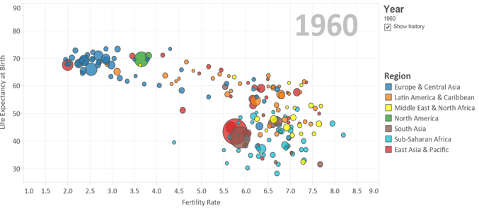
"Rosling realised that you could add extra relationships to charts to make them more rewarding and interesting. He started off with a very simple correlation scatter plot, just showing the relationship between two variables – life expectancy and fertility rate in the chart below. So, the dominant relationship is correlation.
"Then you can add magnitude, to show size comparisons, and use proportional symbols to show the size of populations between the countries in the chart.
"What we're doing is simultaneously showing multiple relationships. The dominant relationship is still correlation, the relationship between life expectancy at birth and fertility rate.

"Rosling is injecting a magnitude relationship on it as well. Then you can add another relationship, which is spatial. This shows the different countries in the map. He does this without using a map, so in this example he's using colour. The other thing Rosling worked out is that you can also use animation to show change over time, this allows you to see how this data changes across different years.”
Gerry: “So, in this final graphic, you've actually incorporated four different relationships.”
Alan: “Yes, so this is an example of how to combine different data relationships. Rosling has simultaneously shown four of the different data relationships displayed in the visual vocabulary: correlation, magnitude, spatial and change over time.”
Axis scaling when telling stories with data
Alan: “Another important way of directly improving your visualisations is through axis scaling. The general rule is for the person making the graphic to decide what is the appropriate scale for the chart. The software is not the thing to decide it for you.
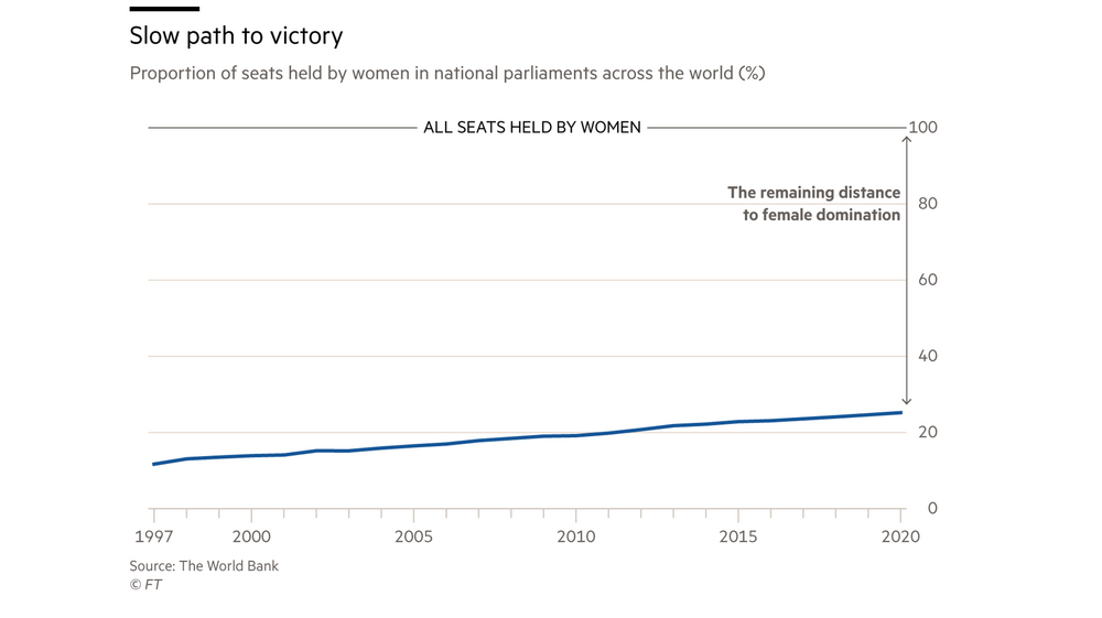
"If you have a chart and you want to discuss gender imbalance by showing the lack of women in elected positions, you could move the scale up to 50%, to show how far away from the target we are. The story might be where there is no data and it just depends where your anchor is. That's your editorial lever, to decide that. You have to get the scaling right once you've decided on the right chart.”

Common mistakes with charts
Alan: “Something I am often talking about is, how do you promote data literacy in organisations? Why do you need to improve the way you present data? One of my favourite examples is about what happened to the Ford CEO. He did a two-hour strategy presentation that included slides and charts with no numbers and all kinds of ridiculous visuals.”
Gerry: “So he forgot about the importance of context?”
Alan: “Yes, badly designed slides and terrible infographics are the worst possible way to present information to senior executives. They prefer reports that have some weight and substance. You can provide that with in-depth data visualisation, things that actually have substance to them.
"The general point here is about communication skills: Do not be someone who thinks they can just liven up a PowerPoint presentation with bright and colourful charts. People want depth and insight, things that mean something.”
Access the in-depth webinar on Data Visualisation, and if you are interested in learning Data Visualisation techniques to benefit your organisation, contact us today. The elearning series has been created in partnership with Alan and the Financial Times.