Apply the benefits of responsive learning in the workplace

We’re now well into #multideviceweek so hopefully by now you’re aware of some of the more unusual ways people are accessing your elearning content.
One recurring theme throughout the week has been responsive design. To highlight the benefits and possibilities of responsive learning we created a mini module using Adapt as a multi-device elearning example.
The module focuses on cyber security and is designed to work on any platform which has a web browser.
Why responsive learning?
Responsive web design
Web access from mobile devices has grown exponentially in the last few years, in order to keep up with so many new devices a new approach was needed.
Google penalises websites which do not work well on mobile devices in mobile search results so creating a mobile friendly version of a site is a must, but designing and maintaining different versions of sites is unwieldy and labour intensive.
Ethan Marcotte coined the term responsive web design and helped popularise it in his 2011 book. It describes the principles of creating one set of content and using style sheets to manipulate it to best fit whichever device it’s being viewed on.
It has become the standard way to design quality websites and its principles are now guiding the way the best websites in the world are created.
From a web design point of view it may seem like elearning design is lagging behind as it drags its feet adopting responsive principles.
But it’s important to look at the staff who interact with your learning and the environment they’re in. The workplace usually has a much slower rate of change of infrastructure, many employees use a relatively basic desktop PC for their day to day work, including training.
But things are changing, with BYOD schemes , the abundance of smartphones and tablets and a younger and more tech savvy workforce all adding up. Mobile apps for specific platforms have been around for years but there are advantages to a responsive learning design approach.
Benefits of responsive learning
A well designed piece of elearning works everywhere your learners will encounter it.
Based on our research into users of the Sponge Launch&Learn LMS we know that real employees are using a huge variety of devices to access elearning right now.
16 different operating systems have been used to access our LMS
Create once, access anywhere
The module looks great on all the screens we've tried from TV screens to windows mobile phones, you can navigate easily using basic controllers for games consoles or a touch screen interface. This is a standalone module but if it was part of a course it could track results and progress and report to the LMS for managers to monitor.
Building a course like this one using technology like the Adapt responsive learning framework means you can create one piece of content that any employee can access from anywhere.
Second screen learning
Being able to access the course on your desktop and your phone has other advantages. The same learner might originally take the course on their desktop PC, but being able to refer to the same content on their mobile phone makes it much easier to apply that training.
In our cyber security example a learner could bookmark the relevant course and return to it if they have a query about an email they've received. Having the training available at your fingertips gives staff the confidence to tackle tricky compliance issues more effectively.
Cost effective
A well designed responsive learning course can take the place of a suite of separate courses designed for specific platforms, reducing the time and investment needed to design, develop and distribute the course for everyone involved. Updating a responsive course is also a much easier prospect than several courses, especially if it involves delivering them in proprietary app stores.
Future proof responsive learning
Your employees will access your elearning on devices that haven’t been announced yet. The rapid rate of smartphone and tablet progression means that new devices appear on a monthly basis.
Building your elearning on web technology is one of the ways you can ensure that it’ll be possible to access it in the future. Making courses which rely on proprietary apps or non-standard technology could mean limiting the lifespan of the content.
Responsive learning design decisions
There are differences in the design approach when using a responsive technology. Sponge developer Jason Butler ran through some of the considerations for creating responsive content in the Adapt hangout .
Mobile friendly interactions
“The real estate you've got available on a mobile phone compared to a desktop means certain components go into a different state. To give you an example, one of the components that we use a lot is a hot graphic where you tap on icons on an image and it brings up a pop-up to explore more. When that goes onto a mobile it then mutates into a narrative component, you can then slide through and find that content a different way. It's essentially the same content but served up in different ways” Jason Butler Elearning Developer Sponge
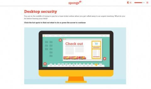
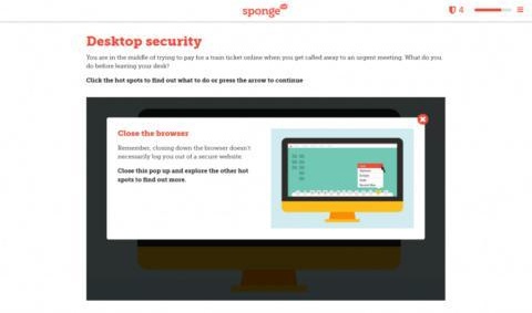
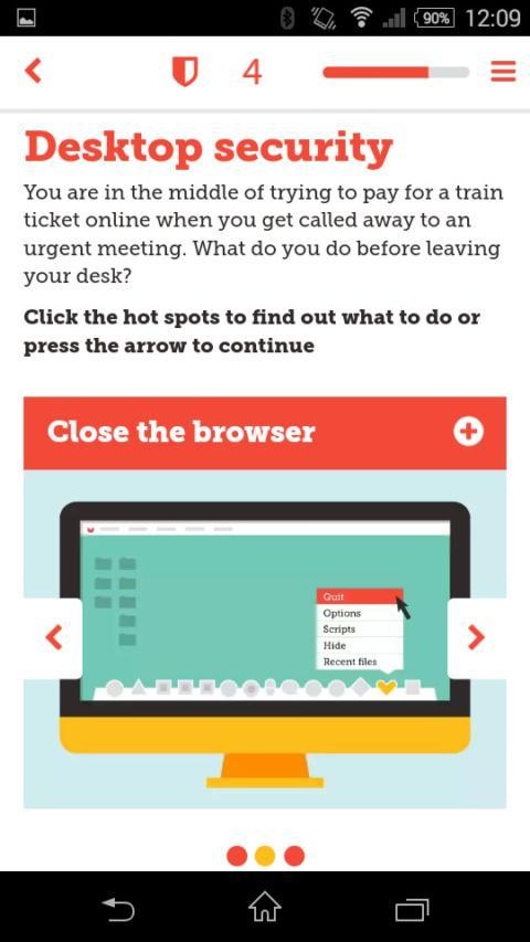
These screenshots show the differences in the hot graphic component on desktop and mobile:

Hot graphic component on a desktop computer screen

Hot graphic component when selected on a desktop computer screen

Hot graphic component on a smart phone

Hot graphic component when selected on a smart phone screen
Less text, strong graphics
Designing for the mobile experience first leads naturally to a text-light approach. Introducing strong graphical elements helps keep learners interested and reinforces the theme.
These considerations lead you to choosing interactions that lend themselves to being easy to use on mobile. Software like Adapt can help with these decisions by automatically changing the layout of an interaction depending on the screen size and input method.
Test on a variety of devices
When testing the module it’s important to use as many different operating systems and devices as possible, ideally with the smallest screen size you expect will be used.
There were some changes made to the length of the component titles which allowed them to be more easily understood on smartphones.
Adapt is set up to reconfigure components in a natural way in order to present the content in the most suitable way for each device.
Responsive components
If you want to include a more advanced interaction component like an elearning game in your course, you need to make sure it’s also responsive.
Using an HTML 5 framework like Phaser to create the games content and adding that to a course built in something like Adapt gives you ultimate creativity without sacrificing accessibility.
Responsive learning is more than a buzzword, it’s one of the most important considerations for any elearning program.
It allows elearning developers to design elearning content that offers an engaging, effective experience on any platform.